
Start with one exportable log format and a single question
The fastest way to turn LLM evaluation logs into something operational is to stop treating the logs as “debug leftovers” and start treating them as evidence. In a 30-minute working session, your goal is not to perfect measurement—it’s to produce two artifacts your team can act on immediately:
- A failure-mode taxonomy that describes what went wrong in plain language and in consistent categories.
- A targeted test suite map that links each failure mode to the smallest set of tests that would catch it before release.
Before you begin, make sure you can answer one question with your data: “Which failures are real and recurring, and what tests would have prevented them?” That dictates what you capture and how you classify it.
Minute 0–5: Normalize and sample the logs for speed
Pull a small but representative slice: 50–150 interactions is usually enough to surface recurring patterns. Don’t optimize for completeness; optimize for diversity across:
- Top user intents (the tasks people actually attempt)
- High-risk surfaces (payments, medical, legal, security, brand mentions)
- Modalities in use (text only vs. image+text, tool calls, retrieval)
Normalize each log row into a consistent “case record.” Even if your source logs are messy, you can quickly extract fields into a spreadsheet or lightweight dataset:
- Input: user prompt + system/developer instructions
- Context: retrieved snippets, tools available, UI state
- Output: model response + tool outputs
- Expected behavior: pass/fail notes or rubric score
- Observed issue: your initial one-line description
If your product uses citations or brand references, tag those cases explicitly. Citation and attribution errors tend to cluster into a few repeatable subtypes; capturing them early makes the next steps much faster. If you need a structured approach, the internal guide on multimodal citation hygiene is a practical lens for spotting missing, irrelevant, or misleading sourcing patterns.
Minute 5–12: Convert raw “bugs” into a consistent failure-mode taxonomy
Now you’ll rewrite vague issues (“bad answer,” “hallucinated,” “confusing”) into a taxonomy that can be counted, tracked, and tested. The trick is to define failure modes by observable behavior rather than guessed cause.
A compact taxonomy template that works across most LLM products
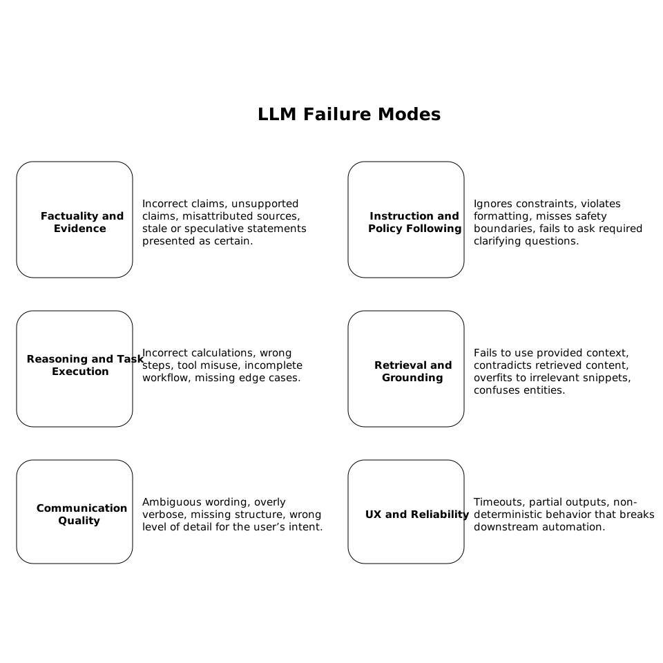
- Factuality and evidence: incorrect claims; unsupported claims; misattributed sources; stale or speculative statements presented as certain.
- Instruction and policy following: ignores constraints; violates formatting; misses safety boundaries; fails to ask required clarifying questions.
- Reasoning and task execution: incorrect calculations; wrong steps; tool misuse; incomplete workflow; missing edge cases.
- Retrieval and grounding: fails to use provided context; contradicts retrieved content; overfits to irrelevant snippets; confuses entities.
- Communication quality: ambiguous wording; overly verbose; missing structure; wrong level of detail for the user’s intent.
- UX and reliability: timeouts; partial outputs; non-deterministic behavior that breaks downstream automation.
Add a second level of labels only where it reduces ambiguity. For example, “Factuality and evidence → Unsupported claim” is a stable bucket that you can map to tests later.
As you label cases, keep a “definition line” for each failure mode: a single sentence describing what qualifies. This prevents taxonomy drift and keeps different evaluators aligned.
Minute 12–20: Identify root signals and severity without boiling the ocean
You do not need a full RCA (root cause analysis) to build a useful test plan, but you do need two fast signals:
- Severity: How bad is it if this ships? (low/medium/high)
- Frequency: How often does it occur in your sample?
Use a simple 2×2 triage. High severity + high frequency becomes your first test suite priority. High severity + low frequency becomes targeted regression tests or “canary” checks.
When you can, capture a quick “likely trigger” field for each case—again, not a full diagnosis, just a signal you can act on:
- Ambiguous user intent
- Missing context (retrieval failed or wasn’t called)
- Tool-call parameters malformed
- Long context causing instruction dilution
- Policy boundaries unclear in system prompt
This is also where you decide whether you need verifiability or provenance for certain outputs. If your failures include “made-up sources” or “untraceable tool outputs,” you may want to explore stronger assurance mechanisms. The internal article on verifiable AI output at the edge using cryptographic attestations is relevant when you need proof that outputs came from a specific model configuration or secure environment.
Minute 20–27: Build the targeted test suite map that prevents repeats
Now translate each failure mode into tests that are small, cheap, and repeatable. Your map is a table with four columns:
- Failure mode
- Minimal reproducer prompt (or prompt+context+tool setup)
- Pass criteria (what must be true)
- Test type (unit, integration, regression, adversarial, monitoring)
How to choose the smallest effective test type
- Unit-style prompt tests: best for formatting rules, required disclaimers, or “must ask a question before answering.”
- Retrieval-grounding tests: include fixed retrieved snippets and verify the answer stays consistent with them.
- Tool-call integration tests: validate correct tool selection, parameterization, and response synthesis.
- Adversarial tests: prompt injection attempts, instruction conflicts, and boundary pushing.
- Monitoring checks: catch drift in production, especially for rare but severe failures.
Be strict about pass criteria. “Helpful” is not a criterion. “Includes exactly two bullet points and cites the provided source ID” is. If you’re building brand-mention or citation rules, specify what counts as an acceptable reference and what counts as a violation.
Minute 27–30: Visualize the taxonomy and map so the team uses it
Your final step is packaging. A taxonomy and test suite map only matter if product, engineering, and QA can scan them quickly. Convert the tables into a one-page visual that shows:
- Top failure modes by severity and frequency
- Which tests cover which failure modes (coverage matrix)
- Where gaps remain (high-severity failures without tests)
This is a natural place to use a text-to-visual tool like napkin.ai to turn your taxonomy and coverage matrix into a clean diagram or infographic that can live in your PRD, incident write-up, or evaluation report. The goal is not decoration—it’s reducing the friction for stakeholders to understand what’s failing and what you’re doing about it.
What you have after 30 minutes
- A practical failure-mode taxonomy with stable definitions
- A prioritized list of recurring, high-impact failures
- A targeted test suite map that ties failures to specific test types and pass criteria
- A shareable visual summary that makes the work legible across teams
From here, you can expand the sample size, refine definitions, and automate scoring. But even this first pass is enough to stop repeating the same failures—because you’ve converted logs into a testable, trackable system.